How to Choose Interior Paint Colors: A Step-by-Step Guide
how-to · October 6, 2026 · Editorial Team

Table of Contents
- Step 1: Assess Your Fixed Elements
- Step 2: Understand Paint Color Undertones
- Step 3: How Lighting Affects Paint Color Selection
- Step 4: How to Test Paint Colors on Walls
- Step 5: Build Your Interior Paint Color Schemes
- Step 6: Choose Paint Finishes by Room
- Step 7: Create Whole-Home Coordination and Transitions
- Common Mistakes When Choosing Interior Paint Colors
- Frequently Asked Questions
Last Updated: October 6, 2026
Step 1: Assess Your Fixed Elements
The first step in how to choose interior paint colors is to assess what you can't change: flooring, tile, countertops, and furnishings. Paint must work with these fixed elements, not against them.
List everything permanent, hardwood floors, carpet, countertops, tile backsplashes, cabinet finishes, and furniture. These set the foundation for your color scheme.
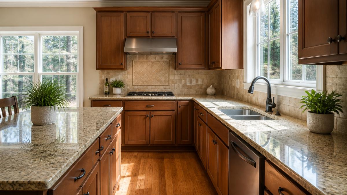 Bright kitchen showing granite countertops, tile backsplash, hardwood flooring, and existing cabinet finishes with natural light streaming through windows
Look at undertones: granite may have warm or cool gray tones, flooring can lean warm or cool, and cabinets have their own color temperature. Your paint must complement what's already there.
Write down the dominant colors and finishes you see. You're simply gathering information about what your paint needs to coordinate with.
Step 2: Understand Paint Color Undertones
Every paint color has an undertone, the underlying color beneath the main color you see. Understanding undertones is essential when you choose interior paint colors that work together.
Warm undertones include yellow, orange, and red. A warm white might have cream or beige undertones; warm grays lean toward tan or brown. Warm colors feel cozy and inviting.
Cool undertones include blue, green, and purple. A cool white might have gray or blue undertones; cool grays lean toward blue or green. Cool colors feel calm and fresh.
The mistake most people make is assuming all whites are the same. A warm white clashes with cool gray flooring, and a cool white looks wrong next to warm wood cabinets.
Compare your fixed elements to paint samples. Does your granite have warm or cool gray tones? Does your flooring feel warm or cool? Match paint undertones to these existing colors.
Step 3: How Lighting Affects Paint Color Selection
Lighting changes everything. The same paint color looks different in natural versus artificial light and shifts throughout the day as sunlight moves through your room.
Natural light is the strongest influence on how paint appears. North-facing rooms get cool, indirect light. South-facing rooms get warm, direct sunlight. East-facing rooms get warm morning light. West-facing rooms get intense afternoon light.
Test your paint samples at different times of day. Paint that looks good at noon might look wrong at 6 PM.
Artificial lighting also affects color perception. Warm white bulbs make colors appear warmer, cool white bulbs cooler; most homes use warm white in living spaces and cool white in kitchens and bathrooms.
Consider when you spend the most time in each room. If you work in your home office in the morning, test colors in morning light; if you relax in your bedroom at night, test under bedroom lighting.
Window direction matters: a north-facing room needs warmer paint to feel inviting, while a south-facing room can handle cooler colors without feeling cold.
Step 4: How to Test Paint Colors on Walls
Testing paint on walls is non-negotiable, but "paint a sample and look at it" is a guess, not a protocol. Here's the repeatable sequence professionals use.
1. Buy the right sample format. Pick up sample pints of every color on your shortlist; a pint covers roughly 30 to 40 square feet in one coat.
2. Prime the test area first. Paint behaves differently over bare drywall, dark colors, and previously painted surfaces.
3. Paint patches at least 2 feet by 2 feet. Smaller patches force your eye to compare the sample against the surrounding wall color.
4. Apply two coats and let them cure. One coat won't represent the finished result.
5. Place patches on more than one wall. Light falls differently on each wall.
6. Leave a gap between patches. Butt samples together and your eye goes to the edge, not the color. Leave 6 to 12 inches of existing wall between patches.
7. View at multiple times of day and distances. Stand 6 feet back, then 10 feet.
8. Photograph the patches, but don't trust the photo. Photos help you compare side by side, but phone cameras and monitors alter color.
**9.
Step 5: Build Your Interior Paint Color Schemes
A strong color scheme uses a foundation color plus complementary secondary and accent colors for balance and visual interest without chaos.
Start with a neutral foundation. Light or neutral colors make rooms feel larger and calmer. Whites, soft grays, warm beiges, and pale blues recede visually and let other elements shine.
Choose secondary colors carefully. Secondary colors add depth without overwhelming. A warm white foundation pairs with warm gray or soft taupe; a cool white foundation pairs with cool gray or pale blue.
Use bold colors as accents. Accent colors draw attention and add personality, on an accent wall, trim, or doors. One bold color is enough; multiple bold colors create visual chaos.
Test how colors work together before committing. Paint foundation and secondary colors on the same wall, see how they interact in your lighting, and adjust before painting the entire room.
Consider the mood you want. Warm colors create energy and coziness. Cool colors create calm and focus. Neutral colors create balance and flexibility.
Step 6: Choose Paint Finishes by Room
Finish determines how the wall handles moisture, traffic, cleaning, and imperfections. Two rooms with identical colors but different finishes look and wear completely differently. The right choice depends on moisture, traffic, cleaning frequency, and wall smoothness.
Flat or matte. The lowest sheen. Flat hides drywall imperfections, tape lines, and patches better than any other finish because it scatters light instead of reflecting it.
Eggshell. A slight sheen, roughly 10 to 25 percent. Eggshell is the workhorse finish for most of the home: it cleans with a damp cloth, resists light moisture, and hides minor wall texture.
Satin. Noticeably more reflective than eggshell, satin resists moisture, stains, and repeated cleaning, the standard choice for kitchens, bathrooms, laundry rooms, and mudrooms.
Semi-gloss. A high-sheen, very durable, very easy-to-clean finish. It's rarely used on full walls because it amplifies every flaw, but it's the standard for trim, doors, baseboards, window casings, and cabinets.
Gloss. The highest sheen and most durable. Almost never used on interior walls, reserve it for trim, doors, and cabinetry where a hard, washable surface matters more than hiding imperfections.
Here's a practical guide by room:
| Room | Best Finish | Reason |
|---|---|---|
| Bedroom | Flat or Matte | Low traffic, low moisture, hides imperfections |
| Living Room | Eggshell | Moderate traffic, easy to spot-clean |
| Dining Room | Eggshell or Satin | Moderate traffic, occasional cleaning |
| Kitchen | Satin or Semi-Gloss | High moisture, grease, frequent wiping |
| Bathroom | Satin or Semi-Gloss | Humidity, splashes, mildew resistance |
| Hallway / Stairs | Eggshell or Satin | High traffic, scuffs, handprints |
| Kids' Room | Eggshell or Satin | Washable, resists crayon and fingerprints |
| Laundry / Mudroom | Satin | Moisture, dirt, heavy cleaning |
| Ceiling | Flat | Hides imperfections, no cleaning needed |
| Trim, Doors, Cabinets | Semi-Gloss or Gloss | Durability, washability, crisp look |
Two rules that override the table. First, the flatter the finish, the more it hides; the shinier, the more it protects.
Step 7: Create Whole-Home Coordination and Transitions
Coordinating colors across your entire home is harder than choosing for one room. Rooms should flow together visually even when they have different colors.
Use the same or similar neutral foundation color throughout your home for continuity. Warm white in the kitchen and soft gray in the living room work if both share similar undertones, the transition feels natural.
Secondary colors can change by room based on purpose and lighting, but they should share similar undertones to maintain visual harmony.
Consider sight lines between rooms. If your living room is visible from your kitchen, the colors should coordinate, clashing colors visible at once create visual tension.
Transitions matter too. Don't jump from a warm color to a cool one in the next room; use a neutral transition color in hallways or entryways to help your eye adjust.
Test whole-home coordination by looking at paint samples from multiple rooms together. Do they work or clash? Adjust before painting.
Common Mistakes When Choosing Interior Paint Colors
Most people make predictable mistakes when choosing interior paint colors. Knowing them helps you avoid them.
Mistake 1: Ignoring undertones. Choosing paint by main color alone causes clashes with fixed elements, leaving paint that looks wrong no matter what.
Mistake 3: Choosing trendy colors without considering longevity. Trendy colors feel dated quickly; neutral foundations with accent colors age much better.
Mistake 4: Painting large areas with untested colors. Committing to a full room without testing is risky.
Mistake 5: Forgetting about lighting changes. The same color looks different at different times of day and under different lighting. Test samples in all conditions.
Mistake 6: Using too many colors. More colors doesn't equal more interesting. A strong foundation plus one or two accents beats five colors competing for attention.
Mistake 7: Ignoring fixed elements. Forcing a color that clashes with your flooring or countertops creates visual conflict. Work with your fixed elements, not against them.
Mistake 8: Not considering the room's purpose. A color that works in a bedroom might feel wrong in a kitchen.
Choosing the right interior paint colors transforms your home. When you're ready to apply your chosen colors, working with experienced professionals ensures flawless execution.
Frequently Asked Questions
What is the 60-30-10 rule for painting?
The 60-30-10 rule guides how to choose interior paint color schemes: 60% is your dominant neutral color (walls), 30% is a secondary coordinating color, and 10% is a bold accent color. This formula creates visual balance and prevents a space from feeling chaotic. Start with a neutral foundation on most walls, introduce a complementary secondary color on one accent wall or trim, then use bold colors sparingly in artwork, pillows, or curtains.
How do you choose paint colors that work with your furniture and flooring?
Pull inspiration directly from your fixed elements: flooring, tile, granite countertops, and existing furniture. Identify the undertones in these materials, warm or cool, and choose paint colors that coordinate. Use sample cards held next to your flooring and furniture in natural light. If your flooring is warm tan, select warm white or warm gray paint. If your countertops are cool gray granite, choose cool undertone paint colors instead.
Should you test paint samples before committing to a full room?
Yes, testing paint samples on walls is essential. Lighting conditions change how paint appears throughout the day, sunlight, artificial light, and shadows all affect color appearance. Paint large test patches (at least 2-3 feet square) on different walls in the room. Leave them up for several days and observe them at different times, morning, afternoon, and evening. This reveals how the color truly looks in your space before you commit to painting the entire room.
What's the difference between paint finishes like flat, eggshell, and satin?
Paint finish affects durability and appearance. Flat finish hides imperfections but is harder to clean, use it in low-traffic areas like bedrooms. Eggshell finish offers subtle sheen and is more washable, working well for living rooms and hallways. Satin finish is the most durable and easiest to clean, making it ideal for kitchens, bathrooms, and high-traffic areas. Matte finishes create a sophisticated look but show dust more easily, while glossy finishes are highly reflective and best reserved for trim or doors.
Frequently asked questions
What is the 60-30-10 rule for painting?
The 60-30-10 rule guides how to choose interior paint color schemes: 60% is your dominant neutral color (walls), 30% is a secondary coordinating color, and 10% is a bold accent color. This formula creates visual balance and prevents a space from feeling chaotic. Start with a neutral foundation on most walls, introduce a complementary secondary color on one accent wall or trim, then use bold colors sparingly in artwork, pillows, or curtains.
How do you choose paint colors that work with your furniture and flooring?
Pull inspiration directly from your fixed elements: flooring, tile, granite countertops, and existing furniture. Identify the undertones in these materials—warm or cool—and choose paint colors that coordinate. Use sample cards held next to your flooring and furniture in natural light. If your flooring is warm tan, select warm white or warm gray paint. If your countertops are cool gray granite, choose cool undertone paint colors instead.
Should you test paint samples before committing to a full room?
Yes, testing paint samples on walls is essential. Lighting conditions change how paint appears throughout the day—sunlight, artificial light, and shadows all affect color appearance. Paint large test patches (at least 2-3 feet square) on different walls in the room. Leave them up for several days and observe them at different times—morning, afternoon, and evening. This reveals how the color truly looks in your space before you commit to painting the entire room.
What's the difference between paint finishes like flat, eggshell, and satin?
Paint finish affects durability and appearance. Flat finish hides imperfections but is harder to clean—use it in low-traffic areas like bedrooms. Eggshell finish offers subtle sheen and is more washable, working well for living rooms and hallways. Satin finish is the most durable and easiest to clean, making it ideal for kitchens, bathrooms, and high-traffic areas. Matte finishes create a sophisticated look but show dust more easily, while glossy finishes are highly reflective and best reserved for trim or doors.